A context-based, form-language for mixed-use, main street buildings


A housing crisis and subsequent apartment building boom has overtaken many America cities in the post Great Recession twenty-teens. Similar transformations have not been experienced in American Cities since the decades following the two World Wars. With rising homeless rates, and spiking real estate prices, we are seeing unlikely marriages of progressive equity advocates and conservative developers. They are partnered with city and regional officials scrambling to weaken or remove previous design standards and review processes that grew out of the 1960s resistance to mid-century, Modernist inspired, top-down planning.
The goals are sound: to build affordable and equitable housing in urban centers by accelerating development entitlement processes, and generating housing supply with the hope of overcoming this ever-growing housing demand.
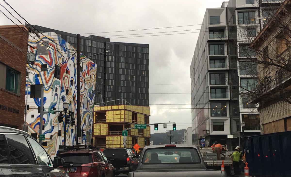
However, in this rush many are losing sight of the aesthetic qualities and functional needs of urban building design, and their importance in creating resilient urban places. This last decade’s newest mixed-use buildings are dramatically changing the faces of main street corridors and town centers with abstract design motifs ranging from McMain Street (Michael Huston, 2019, Public Square) to Rococo Modernism (Deborah Fausch, Rococo Modernism, 2001). These newest architectural attempts at innovative zeitgeist have been dubbed Sketch-up Modern, Break-up-the-Box, Mr. Potato Head Modern (Jonathan Konkol), or Ransom Note Modern (R. John Anderson).
Some public planners and municipal officials have even expressed with increased zeal that as long as the building is affordable and provides more housing supply during this crisis, they “do not care if it’s ugly.” I have heard this sentiment from well-intentioned community members as well as public planning officials and staff.
New buildings should unify past, present and future
Change is happening … that’s inevitable. Yet the evolution of urban communities need not be discordant with their past and present context. Citizens as well as planning and development professionals alike are searching for the language to express why they feel so many new mixed-use buildings are poorly designed, and incompatible with their existing communities.
The majority of contemporary urban housing developers and architects seem unable to arrive at a coherent architectural language that unifies rather than conflicts with the urban fabric, scale, proportions and building types of a harmonious urbanism. The sum of these new buildings is not adding up to an urban quality that is whole, as buildings do in so many enduring older cities.
It appears Modern architectural practitioners and academics have finally hit a dead end. They stripped architecture and urbanism down to the naked essentials in the mid-20th Century by rejecting virtually all references to prior building and urban traditions. Now they are wrapped up in ever-changing cloaks of arbitrary fashion design in a futile attempt to cover their inadequacy to invent a whole new urban form language.
Like the charlatan who convinced the emperor to strip away his traditional clothes and wear an invisible cloak, Modernists have taught each subsequent generation of architects and the public that “less is more,” “ornament is a crime,” “horizontally proportioned windows are streamline,” “highways allow escape from the blighted cities,” and “towers in the park bring healthy light and air.” Modernism has taught for nearly a century that each generation must invent a new expression (zeitgeist), and reject the past.
Today’s Rococo Modernists generate ever shifting attempts to cover their naked, stripped down purism with new abstract, arbitrary graphic designs and fashion moves that have little basis in the time-tested patterns of human scale, proportion, and rhythm.
Buildings should not be designed to look like billboards, vying for attention and in competition with other billboards. Instead, building façades should be designed for the human scale of people walking and sitting on the street and sidewalk cafés, and leaning out their upper-story windows and balconies. Viewing other people is the greatest source of beauty. Thus, buildings that express human proportion, and reinforce place-making are the most beautiful.
It’s all in the window proportions and scale
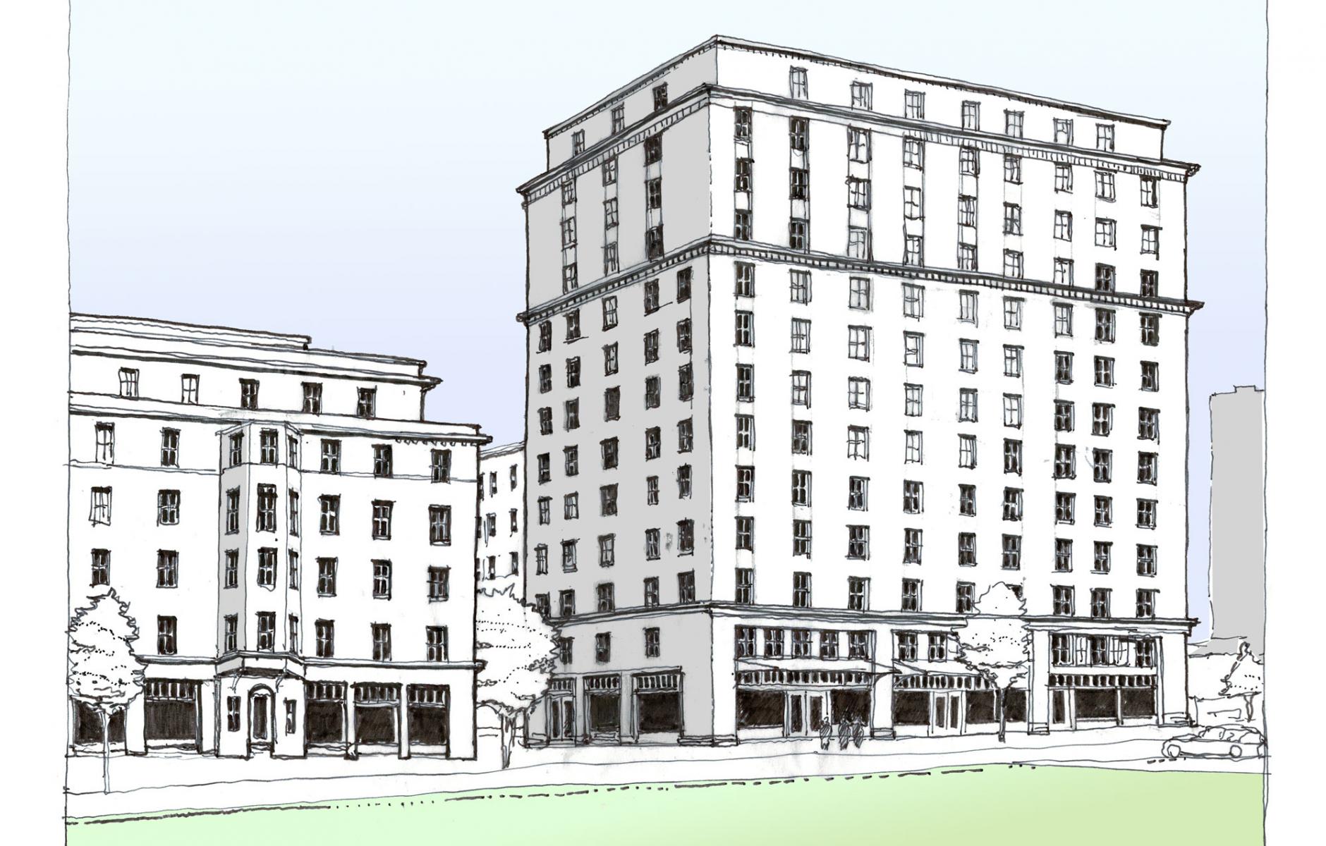
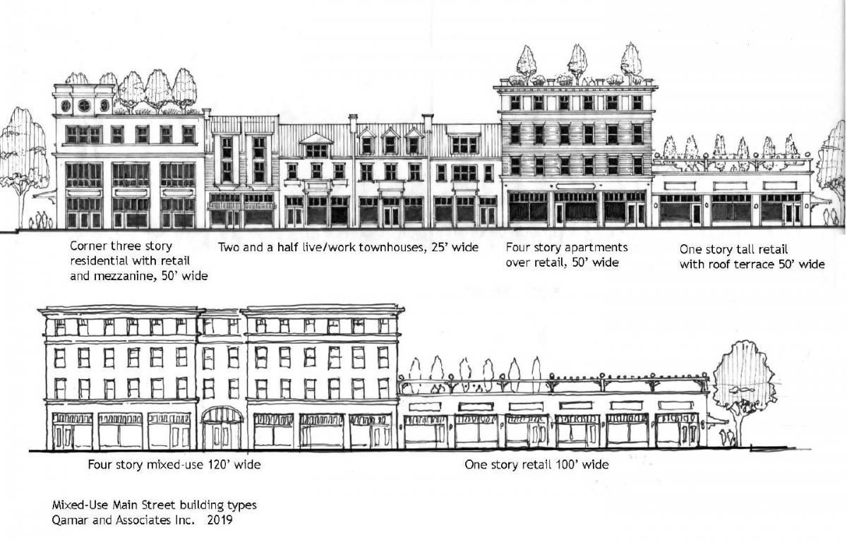
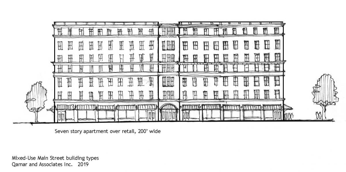
Too often, the newest mid-rise buildings fall short of the distinctive older urban mid-rise buildings from that golden age of 1890s to 1920s, when American cities small and large grew with a coherent, resilient, and easily replicable urban form-language. That form language in mixed-use buildings was consistent at scales ranging from small one-story storefronts to two, three, five, seven and upward stories. These buildings could be as narrow as two rooms, up to as wide as entire block lengths, and still resonate as coherent and harmonious urbanism in all its variety.
Find any old oblique or ground-level photo of any city and town in America, and notice that almost all the windows are tall and narrowly proportioned with deep shadowed insets. While building heights and types varied, this one characteristic brought a consistency and harmony to every cityscape of that time.
How could we describe one building type that is capable of flexibly expanding and contracting from only one to multiple stories, and a variety of widths and yet still be discernible as a single building type?
These window patterns of early 20th Century buildings were the most enduring aspect of virtually all urban, main street and downtown buildings from the smallest western storefronts to the most renowned city center apartments and office buildings. Windows were almost invariably tall and narrow. These windows reflect the same proportions of a standing person, whether on the street or looking out of the building. These windows were most commonly aligned, vertically and horizontally, in orderly rhythms that reflect structural simplicity and regularity.
These window proportions and alignments grew out of simple dynamics of hand-built construction with readily found materials of wood, stone, brick, and mud throughout the millennium. A narrow span of a lintel over a window has always been the most efficient and economical. Stretching that narrow opening into a tall, vertical proportion was both compatible with the human form, and an economical form to circulate air and save on materials. The tall, narrow window is ubiquitous throughout human history, and I would argue it is an inherent part of our human form language …
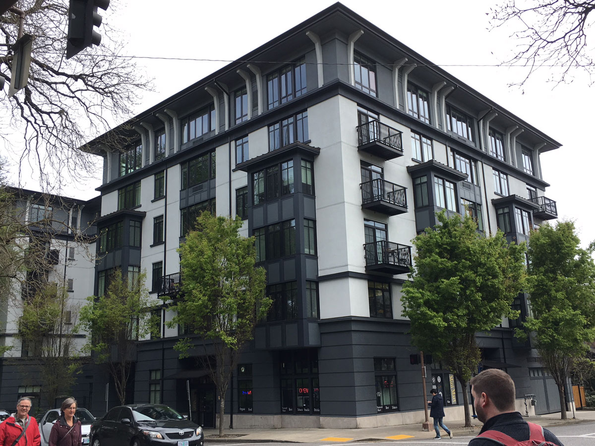
… Until the modern introduction of steel, which introduced the horizontal proportion of ribbon windows and cantilevers. There are some fine examples of the use of horizontal proportions (Frank Lloyd Wright, etc.). And yet current attempts at urban mixed-use buildings are producing a much less articulate language, such as whole facades cantilevered over sidewalks, and randomly-scaled horizontally proportioned window walls—and random building projections.
Basic farmer’s logic
Modernists often declare that old buildings would be much too costly to build today, so we need to forget the past and design with Modern materials and compositions that are more affordable. This dismissal could not be further from the truth. In reality, this current era of Rococo Modernism often results in less affordable new housing construction with unnecessarily complex and costly “curtain window” walls, staggered window arrangements, collages of pastiche materials, and extruded Sketch-up modeled projections all aimed to evoke false variety by “breaking up of the box.”
Walsh Construction Co., one of the preeminent affordable housing contractors in the Pacific Northwest, has put out a white paper called “Cost Efficient Design and Construction of Affordable Housing.” They have seen so many architects struggling to design an efficient and affordable building while simultaneously striving to design innovative, complex, and graphically flashy buildings. Walsh strives to clarify for architects and developers what it takes to keep costs down, especially for affordable housing projects. Without implying any sort of design philosophy, they simply described what their Innovation Director, Mike Steffen, calls “farmer’s common sense” and to “strive for simplicity.” They include recommendations like:
- “Excessive form articulation, not stacking units, cantilevers, or mixing steel with wood framing … introduce complexity and increase cost.”
- “Stack walls and unit plans … and align openings within walls … This will provide continuous structural load paths to the foundation, decreasing structural complexity and cost.”
- “Avoid structural cantilevers if at all possible.”
- “Keep building massing as simple and compact as possible. Minimize stepping in the exterior wall plane.”
- “Attempt to standardize and optimize 80 percent of the building design while saving 20 percent of the design for customization.”
- “The use of repetitive components such as windows and door … will lead to reduced costs.”
In other words, to design true affordable housing, start with a box whose exterior load-bearing walls run to the ground without cantilevering, and align windows vertically, and horizontally. In many ways this sounds like the way buildings were designed and constructed for millennia up until about 1930.
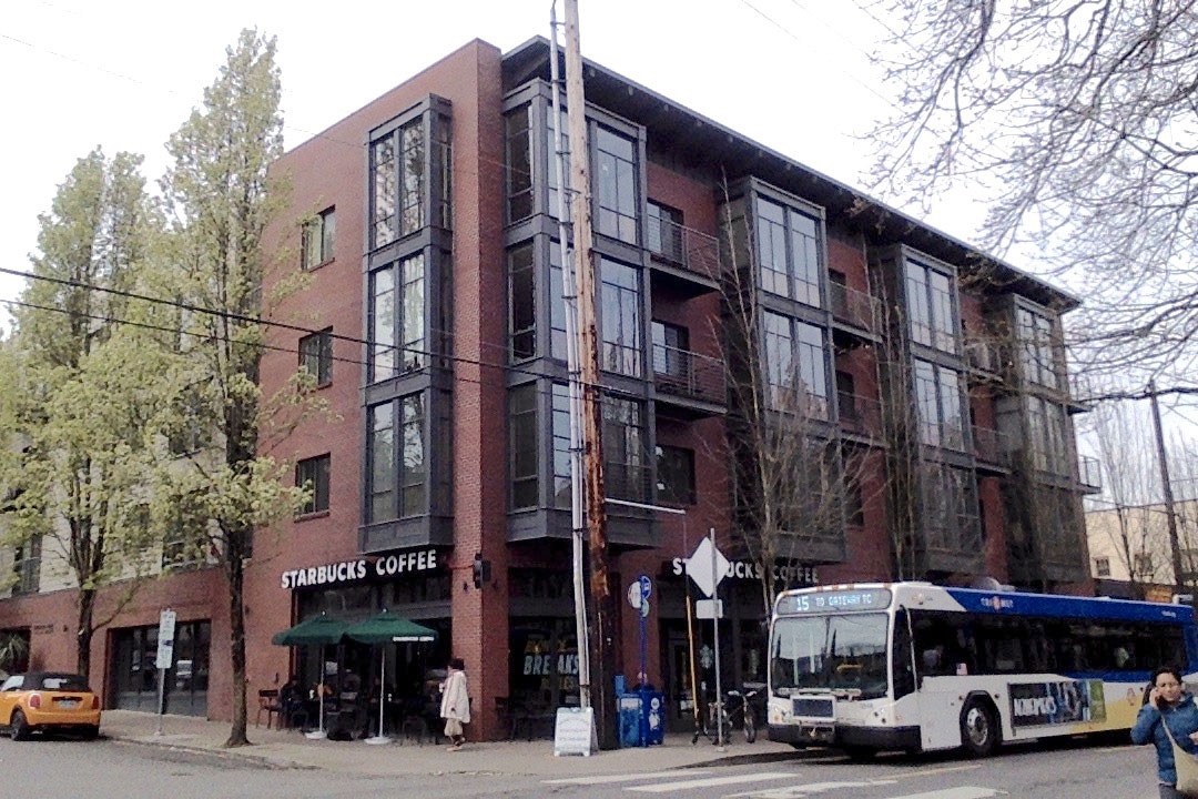
Along with vertically and horizontally aligned windows, adding of a couple of cornices to a facade can provide visual divisions between ground floor retail and upper residences. A cornice or eave at the top helps hide utilities on the roof, provides a little weather protection, and offers an attractive silhouette to the sky.
Contextualism based on human proportion
Contemporary architects often design building facades to reflect internal functions and layout, which results, in part, in the abstract and ill-proportioned facades described above. Instead, composing facades with more consistent, regular window rhythms allows interior floor plans to be flexible and modifiable over time—and is therefore more resilient. In this way, the facade's form follows the urban function of a harmonious contextual language. Resilient architecture is not stuck in the present—not stuck in the zeitgeist of one contemporary fashion. Resilient architecture spans past, present, and future with one common language—not a different language for each new generation. Modernism’s attempt to deny tradition is effectively the antithesis of resiliency. When new buildings are designed with a new language for each new generation, we are doomed to forget the lessons of time-tested urbanism.
There is a simple solution based in the time-tested patterns of human scale, proportion, and rhythm that can be dressed in any number of materials and levels of ornament, or no ornament at all as long as proportions are consistent.
It has been the goal of new urbanists for nearly four decades to reverse the urban flight to the suburbs, and revive our moribund urban neighborhoods. We now are experiencing a welcomed reversal of that flight with a return to many historic city centers, and inner first ring neighborhoods with reinvestment in a building boom that is unsettling to many community members of virtually all socio-economic groups.
This new reinvestment in urban building will be more accepted by communities, and more resilient in future generations, if we can promote a simple, affordable, and aesthetically pleasing form-language that builds on the past, and yet projects into the future.


