The State of Coronavirus in America


The coronavirus affects every city and town in many ways—and communities won’t begin to understand the extent of its impacts until the immediate crisis is over. My aim is to present facts on the coronavirus pandemic in a way that clarifies the crisis to readers, and, along the way, sheds light on where we are now and where we are headed.
The report is different from other analyses in its method and geographic focus. First, it looks at mortality rather than coronavirus cases. The number of cases discovered depends on testing. As the US ramps up testing, I expect to see a great increase in cases. But that doesn’t mean that the underlying problem is getting significantly worse. On the contrary: Testing may be our best tool to control the spread of the disease until we get a vaccine. Fatalities with COVID-19 symptoms are much more likely to be tested, especially in the last three weeks. Also, importantly, the report examines mortality through the lens of a per capita rate—allowing for apples-to-apples comparisons in geographic regions with widely differing populations.
With the rise in testing, and many news reports focused on cases, most of what we hear is going to be bad news in coming days and weeks. That news may obscure what we don’t know—how many of these cases are mild.
There are downsides to looking at mortality. One, it’s a morbid topic. It’s much easier to use the antiseptic term “cases.” There is value in reporting cases, and I will examine this crisis from that angle in coming weeks. Two, mortality is something of a trailing indicator—since many of the fatalities today may have originated from infections that occurred before the US was able to shut down gatherings, schools, and meeting places.
Yet for now, mortality may be the best—and ironically the most hopeful—indicator of the extent of the pandemic across the US. To avoid repeating the word “death” or any of its synonyms too many times, be aware that when I write “rate,” I refer to a per capita mortality rate, unless otherwise specified.
The rate is a proxy for the medical resources needed and used to treat the virus. Mortalities represent the most serious cases, generally involving intensive care and ventilators. For each death, there are X number of serious cases requiring hospital admissions and specialized treatment. I don’t know what that number X is, but it is likely to be comparable region-to-region.
That brings me to the geographic focus. I ran the numbers for each state, and grouped the states into regions of the country. Especially since the nation is in a lockdown of sorts, this disease and its impacts have become far more regional. The way the virus has hit sections of the country differs greatly—for example, the Pacific and Southeast regions are nearly identical in their rates, but those regions differ significantly from Northeast, where the rate is 16 times that of the Heartland (see the map at the top). The Great Lakes region’s rate is double that of the Mountain states. The acceleration of the virus varies from coast to coast. The regions are likely to peak at different times and several contain infectious “hotspots.”
This report attempts to get a handle on divergent situations around the country. The numbers are calculated on a daily basis to discover and highlight the underlying trends related to this rapidly evolving crisis. The states and regions can be compared to each other, the nation as a whole, and other countries. I prepared graphs, so that these rates and trends can be better understood visually.
I plan to update the report weekly on Public Square for as long as necessary. The title has its origins in an annual report I wrote in the 1990s on recycling and solid waste called The State of Garbage in America. That report would take me three or four months to prepare, was cited in major publications, and it lived up to its bold name. I don’t have that amount of time now, or a team of expert assistance. Despite the name, the report does not attempt to cover everything. Nevertheless, it offers a unique view on the coronavirus in the US by organizing facts in a different way. Some of the gaps in today’s report will be filled in future updates.
The data is gathered from the Worldometer, which gets high marks for accuracy and is updated constantly. This website gets its data from the World Health Organization, the CDC, and other reputable sources. For daily figures, I used the Internet Archive to examine Worldometer pages over the past few weeks.
Nation
The coronavirus has taken an awful toll across America, yet we have been lucky—relative to many European countries so far. In the graphic below, I compare the rate in the United States to several other countries on the same scale. All of the graphs start on March 9, the day that Italy went into lockdown. The bars start at zero, so there is no visual exaggeration.
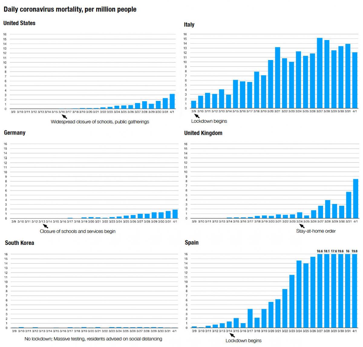
America does not yet look like these European countries, save Germany—which has been widely credited with containing the virus. The US and Germany began widespread social distancing measures while the rate was still very low—about a week ahead of significant fatalities. Italy and Spain were hit by the virus earlier and it gained a lot of momentum before their economies were locked down. Spain is literally “off the chart,” and the numbers above the last six bars tell by how much. The graphic also dramatically shows the success of South Korea, which has successfully contained the virus without a lockdown, by using a program of massive testing.
Some people predict that the US is headed to the place where Italy, Spain, and now France have been in the last two weeks. New York State, where I live, is already there, and so is New Jersey—both reaching daily rates of more than 20 deaths per million people this week. Connecticut (with much of its population in the New York City suburbs), Michigan, and Louisiana are nearly there—they are around the levels shown to the right on the UK graph.
Yet the US is a big country, and the coronavirus remains a regional phenomenon. Most of the US is nowhere near the levels experienced in the Northeast or the worse-hit nations. Even in the worst day of this terrible week, 31 states had daily rates of less than, or around, one per million—including some big states like Texas and Pennsylvania (surprisingly, given its proximity to both New York and New Jersey). That rate is a quarter, or less, of the current national average.
With gatherings banned and schools closed and spring emerging, much of the nation may yet avoid the worst fate in the immediate future. Outside of the New York City metropolitan region and a few hotspots, hospitals have excess capacity because elective surgeries have been canceled. The coronavirus is very unevenly spread around the US, which may make the case for a more regional—and even local—approach to fighting this war in the future.
Northeast
I’m going to discuss the hardest hit region first, saving the better news for later in the report. With less than a fifth of the nation’s population, the Northeast has 57 percent of the coronavirus fatalities, and its rate is accelerating faster than other regions. Here’s the graph for the Northeast, with data up to April 2. The graph starts March 19, the first day I was able to obtain state-by-state daily rates. Otherwise, the scale of this graph is the same as those shown for the nations above.
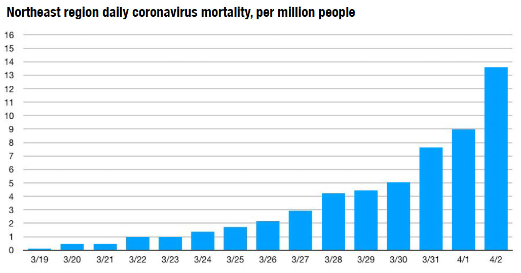
The vast majority of the problem in the Northeast is contained in the New York City metro area, which explains the high rates in New York, New Jersey, and Connecticut. Massachusetts is slightly above the national average. The other states in the region appear to be keeping a lid on this virus so far. Even within New York State, which is by far the nation’s hardest hit, many areas are less affected. My small region, Ithaca, has had a lot of cases. But most have been mild and there have been no fatalities.
Southeast
The rise in mortality has been gradual in the Southeast, the most populous region with 81.9 million people. Here is the graph.
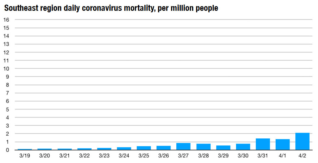
There is one hotspot, the City of New Orleans. That explains a relatively high rate in Louisiana, nearly 8 per million as of yesterday. Louisiana spiked last Friday, but has mostly plateaued since. We will see next week whether that trend continues. All of the other states in the Southeast are well below the national average and about half are at or below 1 per million.
Florida, the largest state in population, was at a low rate until yesterday, when the number rose significantly—yet the state remains well below the national average.
Great Lakes region
The Great Lakes region has the second highest rate in the US. The rate rose considerably on Tuesday, but has since plateaued and even tapered a bit.
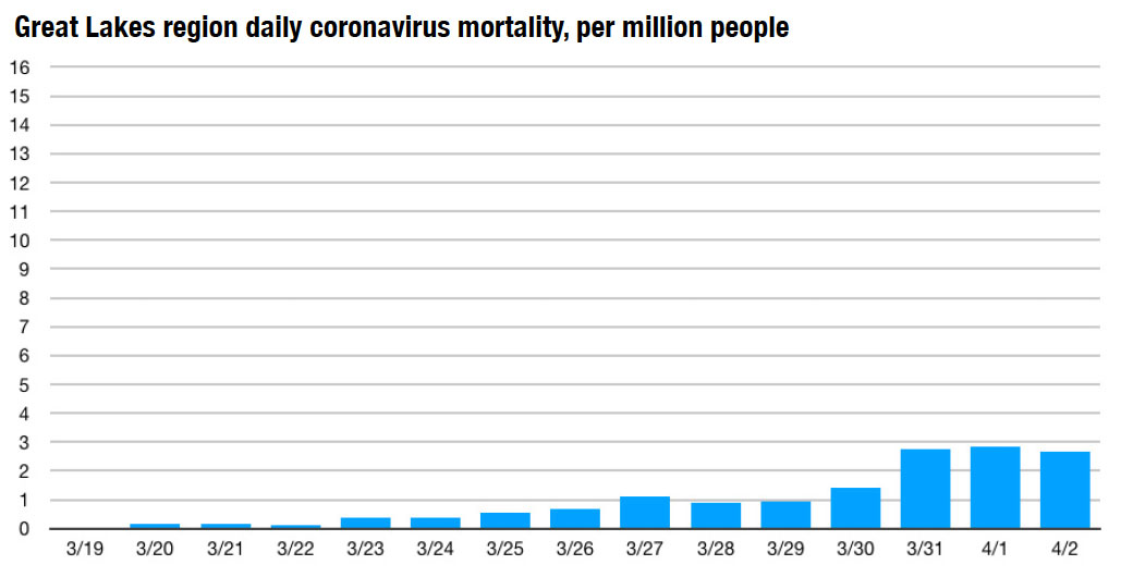
One state, Michigan, accounts for more than half of the COVID-19-related fatalities in the region. Wayne County, which includes Detroit, is the epicenter in Michigan. Outside of the New York City metro, this appears to be the hardest-hit area. Other Great Lakes states are well below the national average—especially Minnesota, where the rate has been under 1 per million every day, and its total fatalities have ranged from 1 to 5 over the last nine days.
Even Illinois has a daily rate of just over 1 per million, which tells me that Chicago is in better shape than Detroit, New Orleans, and New York City.
Heartland
The Heartland, which is mostly the Great Plans, still looks like the nation did in early- to mid-March. There has been a slight uptick this week in the region of 51.8 million people, which includes Texas.
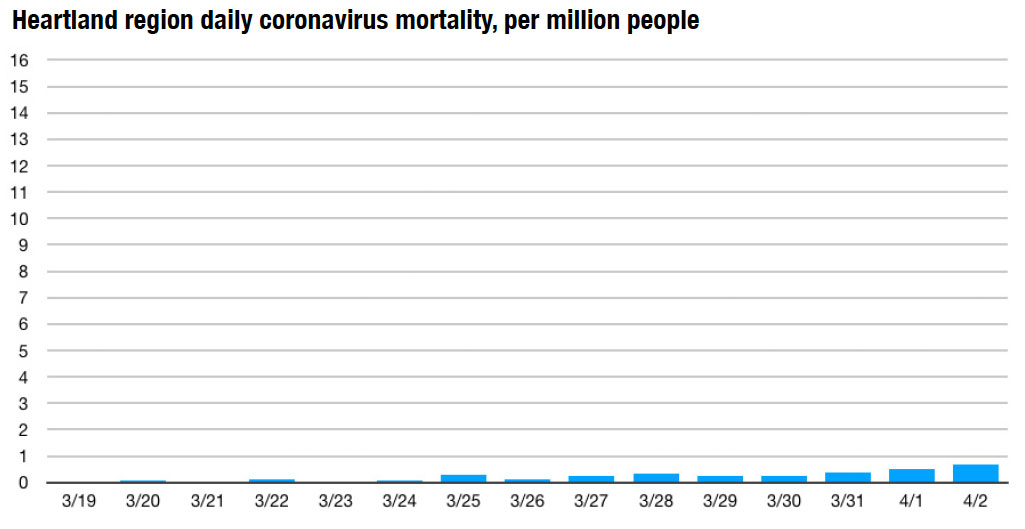
The levels remain very low in the Heartland, and there is real hope that with more vigilant testing this region can continue to contain the virus. Texas, with 29 million people, is obviously a key state to watch. There was a rise in fatalities in Texas in the middle of this week, but the rate remains well below 1 per million. That’s true for all of the states in the Heartland.
Mountain
The Mountain region has a population of 24.9 million spread out over a very large area. It has seen a gradual rise of the rate, especially yesterday.
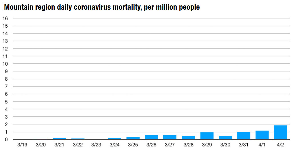
The biggest problem in this region is centered on Colorado, which currently has a rate of about equal to the national average. Most of the other states have rates that are below 1 per million. Nevada is inching towards the national average.
Pacific
The Pacific region was the first to experience the coronavirus in the US, and Washington State led the nation in early mortality. California was where the ill-fated Princess Cruise docked on February 21, and thousands of passengers got on an off. On the whole, this region offers great hope for the nation, because it has mostly contained the acceleration of the virus.
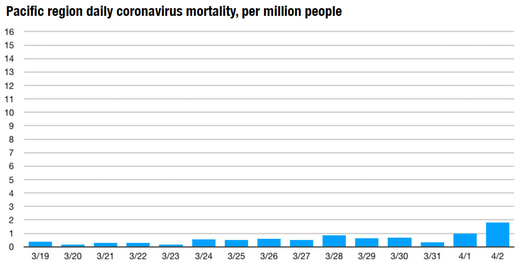
The graph looks like the trend is heading up for now, but the visual may be misleading because the numbers for Tuesday were very low. The region had a significant rise yesterday, up to 1.8 deaths per million. The next week will tell whether that is a short-term blip or the beginning of a new higher level.
The key to the Pacific region is California, which is home to nearly three-quarters of the region's population. The state’s residents were told to stay at home March 20. Despite an increase in this week, the rate remains well below the national average, a little above 1 per million.
This report has a somewhat more hopeful outlook than many others in the media—at least for areas outside of the New York City metro area and other epicenters of this crisis. I'm assuming that people will follow the guidelines and rules set forth by federal, state, and local authorities. Coming weeks will tell whether these regional trends hold up. Like most Americans, I am staying at home and will continue to track the numbers, and I will update this report next week. Until then, be safe and well.