-

Comparing the neighborhood and sprawl
An iconic new urban diagram from the 1990s shows a walkable neighborhood, top, compared to conventional suburban development, below. The uses are the same but the organization of the uses are different. This drawing by Thomas Low for DPZ was widely used by new urbanists to explain why development...Read more -
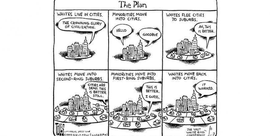
Vast white ring conspiracy
As usual, Washington Post cartoonist Tom Toles was ahead of his time when he drew this in June of 1998. Toles condensed the history of race and urban demographics in the last half of the 20th Çentury into six panels. Despite a massive recession 10 years after this cartoon was drawn, the last slide...Read more -
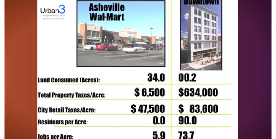
Walmart versus the city
This is what urban economic analyst Joe Minicozzi calls "The Money Shot," comparing a Walmart in Asheville, NC, to a downtown mixed-use building in the same city. He puts all of these economic indicators side by side that show the relative poor performance of Walmart, which is the gold standard of...Read more -
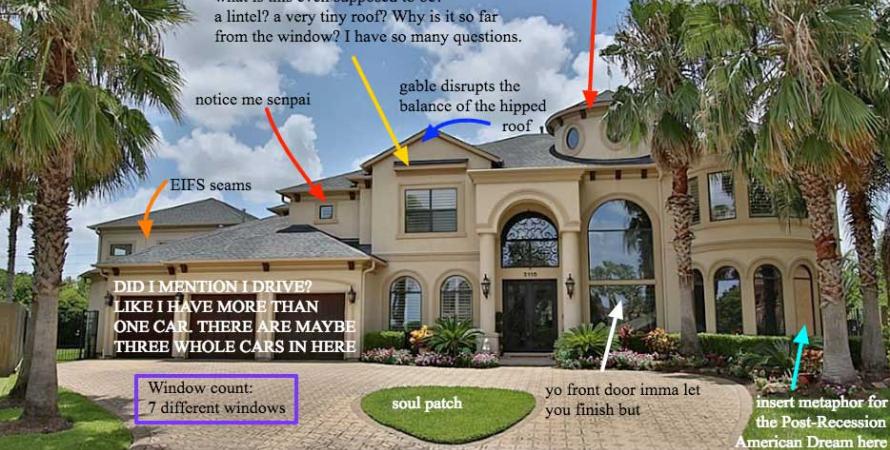
When houses go bad
Do you love to hate the over-the-top residential architecture of outer-ring suburbs?Do you love to hate the over-the-top residential architecture of outer-ring suburbs? A new blog called McMansion Hell is worth a look. Kate Wagner, a master's student specializing in architectural acoustics at Johns Hopkins University and Peabody Institute in Baltimore has created a witty and...Read more