Video tells the tale of impressive Belgian New Urbanism


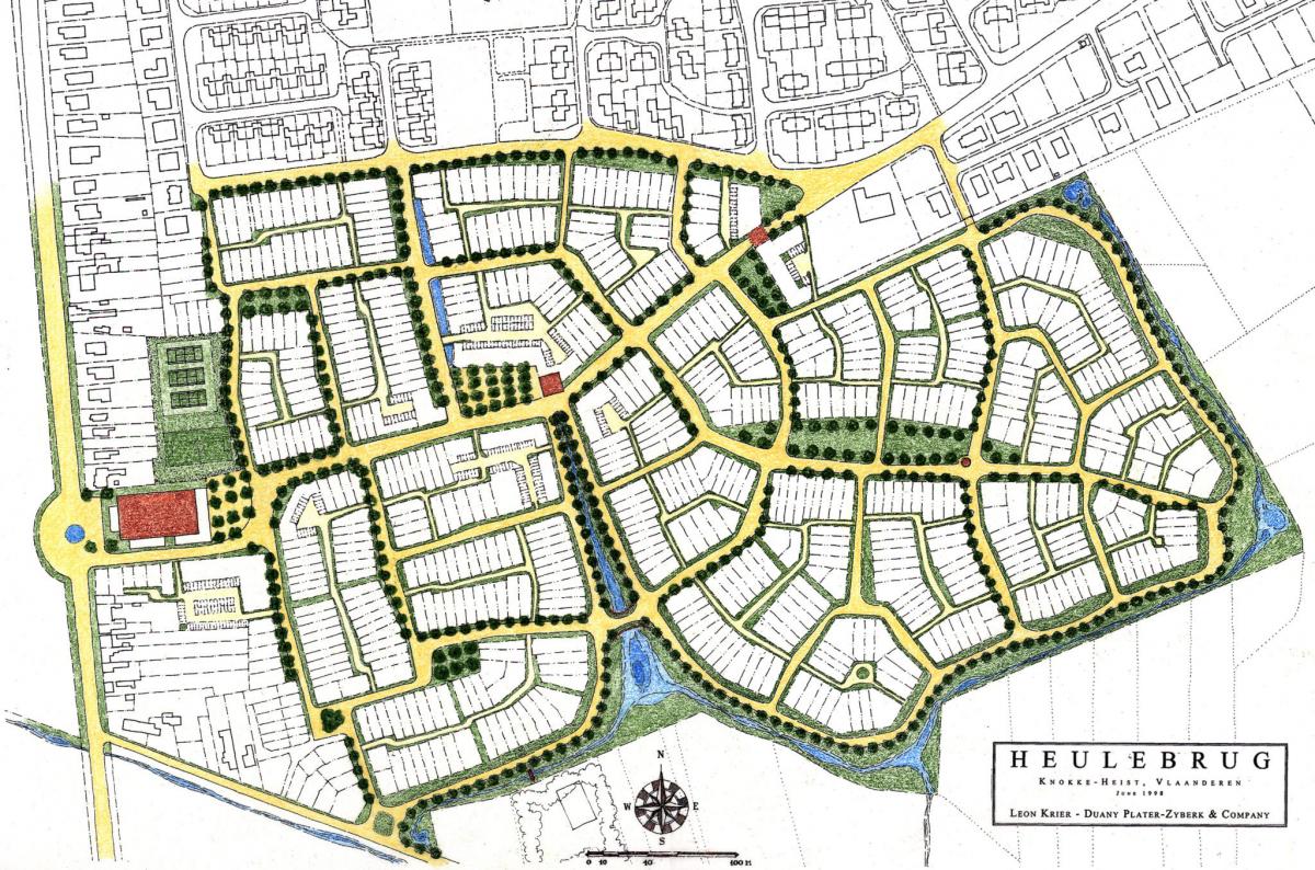
A team of new urbanists went to Belgium in 1998 to design a small new neighborhood, an extension of a seaside resort town, at the invitation of the mayor. A weeklong charrette produced an impressive town plan and renderings, along with an implementation kit—including design guidelines, a platting system, and proposed house designs.
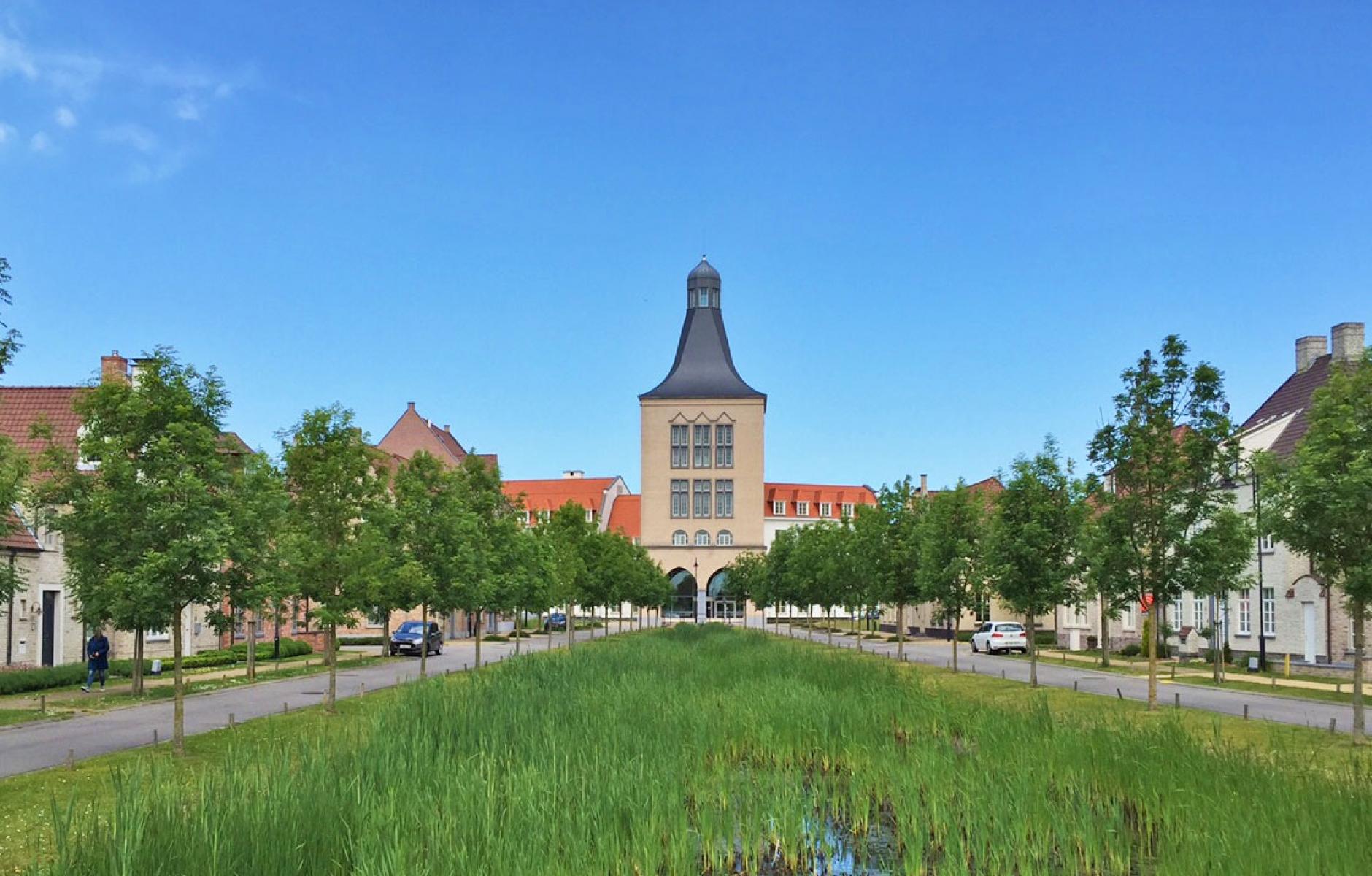
Twenty-seven years later, the town extension is built as planned, looking very much like the charrette renderings, with Flemish vernacular architecture, intimate streets, a central plaza, a canal, and more. A popular YouTube video by The Aesthetic City, “They Built a New Town in Belgium and it’s STUNNING,” tells the tale of Heulebrug, a 25-acre new neighborhood in the town of Knokke-Heist.
The 13-minute video (embedded at the bottom of this piece) is an informative testament to New Urbanism and the team led by Andres Duany and Leon Krier, which included many designers including author and planner Jeff Speck. The man who really made it happen is then-Mayor Leopold Lippens, who was dissatisfied with the ugly architecture they were getting in Knokke-Heist, and with plans for a new development site.
A prominent banker (and Count) who led the city for 40 years, Lippens learned about Seaside and insisted the town work with DPZ, who teamed with Krier. Lippens died four years ago (and Krier this year), but he lived long enough to champion the project along with people he hired like engineer-architect Mathias Delrue, who has worked on Heulebrug for more than 25 years.
I spoke with Duany who said that the plan was “violently attacked by modernists” who tried to undermine it. Only the protection of Lippens saw it through as designed. Duany adds that the plan began as subsidized “social housing,” but allowed homeownership. The video does not mention the social housing aspect, and it sounds like the development may have evolved to be totally market-rate.
The video identifies six design keys that have contributed to the character of the place:
- A system of design building blocks with clear delineation of public and private space.
- The street system is organic with slight curves and turns.
- The plan opens up to the surrounding countryside, giving everyone views.
- It is designed as a mixed-use development. Currently it only has a pharmacy. But it is within walking distance of more extensive commercial spaces including grocery stores.
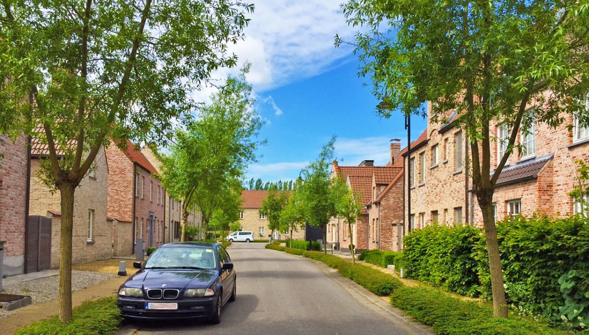
- The architecture reflects local Flemish vernacular, including the nearby medieval city of Bruges, using classical principles and pitched roofs.
- The backs of the houses face alleys, which are good places for people to meet and children to play (a basketball hoop is shown).
The video explains five insightful lessons learned:
- A good plan doesn't take long to be made, but guarding it can take decades. This is truly the story of Heulebrug.
- Put cars at the back. The alleys mean that the fronts stay civil and free of automobile-oriented clutter.
- Review plans intelligently. "Don't just enforce a dogmatic scheme of aesthetics, but have reviewers explain why" certain details, like cornices, matter.
- Guard the landscape for everyone. Don't sell the quality of the landscape as a luxury to single lot owners. (It raises the value of the entire neighborhood).
- Have a spine. You need a promoter of the plan who defends it, in this case, the mayor.
The narrator says: “Today, the result is stunning. Beautiful brick facades line intimate streets. The tall tower intuitively shows where the center is located. And a canal pulls both greenery and water straight into the center.” He adds, “Not only has it become a popular place to live, but been shown to be friendly to children.”
The video concludes by pointing out some of the flaws. Some of the architecture is a big bland, the narrator points out. There are fewer shops and services than were planned (Duany explains that the project has no frontage on a major road). But the narrator characterizes these as quibbles, as the title and general tone of the video attests.