Real estate markets revealed


Geography and demographics geeks might want to check out a unique new resource—a fascinating interactive map with local information on real estate markets.
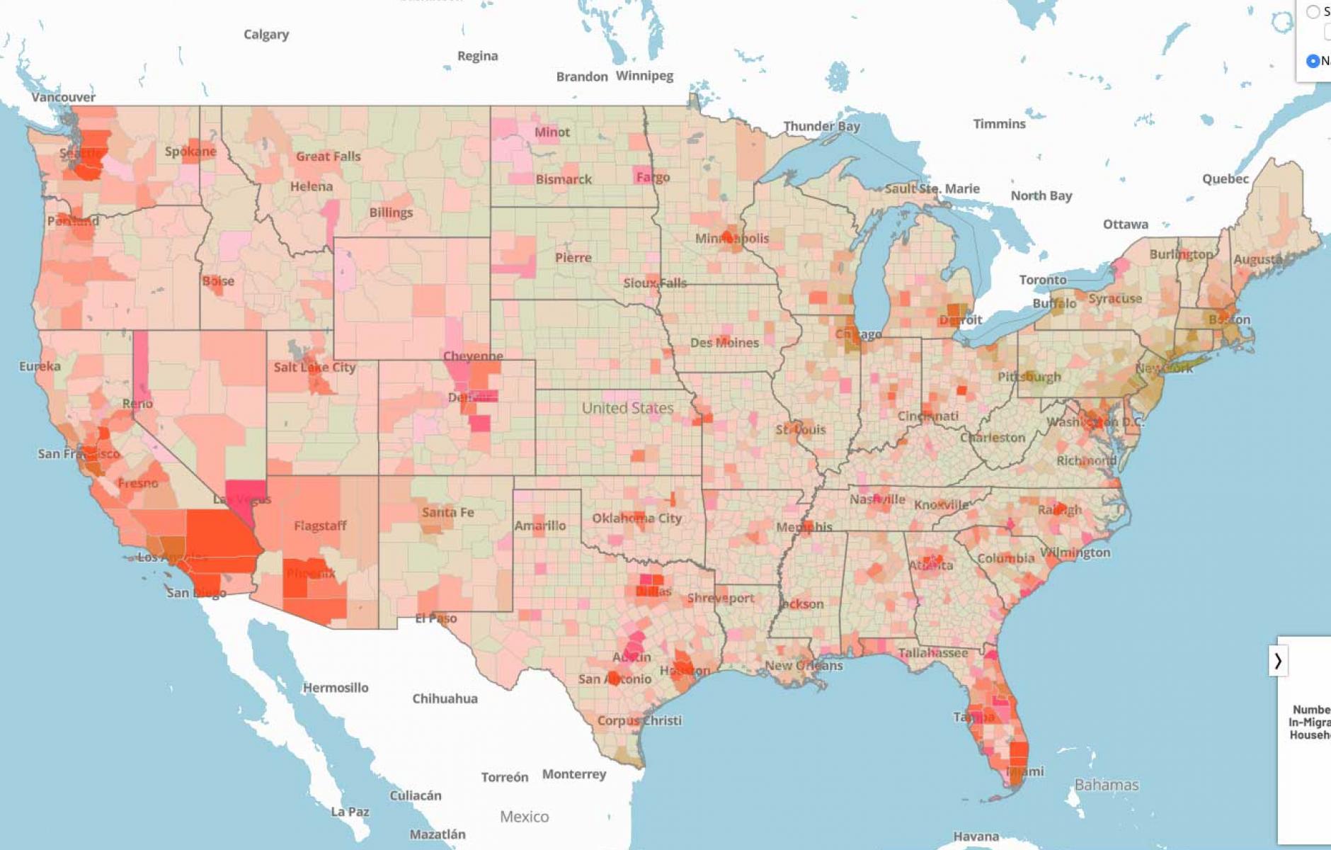
The map was created by Zimmerman/Volk Associates (ZVA), the firm that invented the target market method of real estate market research. This method has been used since the 1990s in many new urban and urban revitalization projects—often because conventional market research failed to accurately capture market demand for “missing middle” housing types in a walkable urban context.
The target method focuses on, among other data, migration and real estate mobility—and with the map you can find data on these metrics for any county in the US. “What we are measuring is market turnover, or how fast the market moves (mobility and migration) relative to its size (occupied households),” says Chris Volk-Zimmerman, co-managing director and son of the founders, Todd Zimmerman and Laurie Volk. “It helps understand what is the potential pace of change, or generally how fast new development can be absorbed. This would be important information to bear in mind in say, adapting a particular geography to climate change, if you wanted to know how fast it could be done based on market forces.”
When you click on any county, you get the median household income, median home value, number of households, and the “mobility distribution index,” a standard calculated by ZVA. This is a measure of market strength. At the click of a button, the index is available relative to the state the county is located in, or the nation as a whole. My county, Tompkins in New York, has a state index of 1.5, which means that it is capturing a much larger share of the in-migration of households than would be expected (1.5 times), relative to its size and the rest of the state. The market also shows how many people are migrating into the county on an annual basis, and the top three counties contributing to that in-migration (in this case, three neighboring counties).
The map uses various data from the IRS and the American Community Survey. It allows one to compare the market for any county (or county equivalent like a parish in Louisiana or independent city) to any other county in the state or the nation.
ZVA is improving the map so that it will soon provide data at the level of the census designated place. “Since it is a finer grain, you [will] have a national, state, and county index,” says Volk-Zimmerman. This will show the relative strength of submarkets within each county.
If you want more market data on the county, you can pay for a more detailed report. “It contains the origins of the migration, out migration and net,” says Volk-Zimmerman. “It breaks down all the different indices so you can see who is attracted to this location. There’s also a demographic summary by individual year showing the value trend.” Here's a sample report.
I am going to go back to this interactive map again and again to get a sense of the market in places that we are covering in Public Square. I am looking forward to the finer-grained version. And, ZVA has even more plans for this map. Stay tuned.