Cleaning up a mess in Long Island City


Note: This article is part of a collaboration between Island Press and Public Square on a series of articles based on recently published books on subjects related to urbanism.
A lot of us are driven by the urge to fix damaged things, make broken things work, if not actually heal the landscape. In the early 20th Century, Queens Plaza, where the borough of Queens’ major thoroughfare stops just short of Manhattan, was a grand civic square. After decades of huge infrastructure projects, Queens Plaza was considered a terrible place.
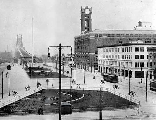
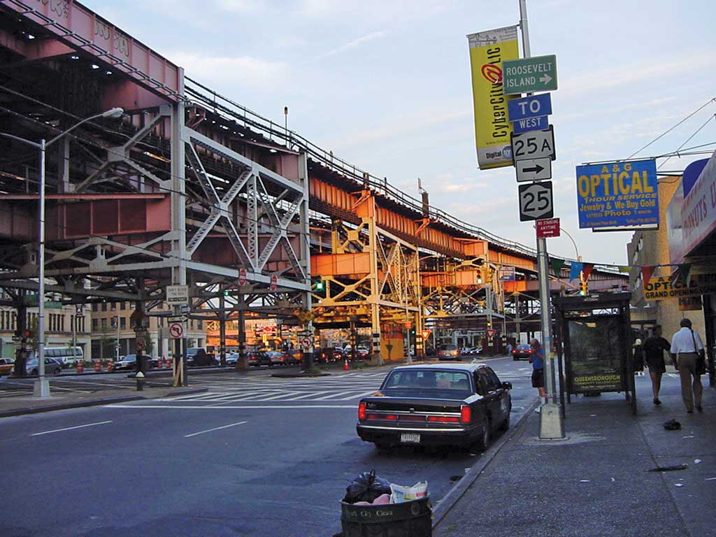
A tangle of elevated trains and bridges, it spread out in a chaotic sea of roadbeds and parking lots, run through by a depressed business corridor. Among the few businesses to thrive were a number of gentlemen’s clubs, supported by both the sex and drug trades that found a haven in Queens Plaza. To top it off, when prisoners were released from Rikers Island they were dropped off at Queens Plaza, under the elevated, in the middle of the night, with several dollars to get them wherever they were going.
Starting in the late 1990s, the New York Department of City Planning and several nonprofits launched an effort to transform Queens Plaza—to make it less dangerous, more welcoming, and to attract businesses to the area. An ideas competition run in 2001 by the Van Alen Institute yielded compelling visions for the area that built on, rather than tried to mask, the imposing infrastructure.
In 2003, building on the enthusiasm that the ideas competition sparked, the Department of City Planning launched the Queens Plaza Pedestrian Bicycle Improvement Project. The goal was to humanize the massive swath of concrete and metal—the broad roadbeds, the elevated train tracks, the bridge itself. The project also sought to mitigate the noise and pollution from traffic on and off the Queensboro Bridge and the sound of the elevated trains that had come to be known as “the screech.” My team submitted a proposal and won the project with an urban designer, a civil engineer, an artist, a lighting designer, an environmental engineer, and a number of subconsultants.
Reinventing infrastructure
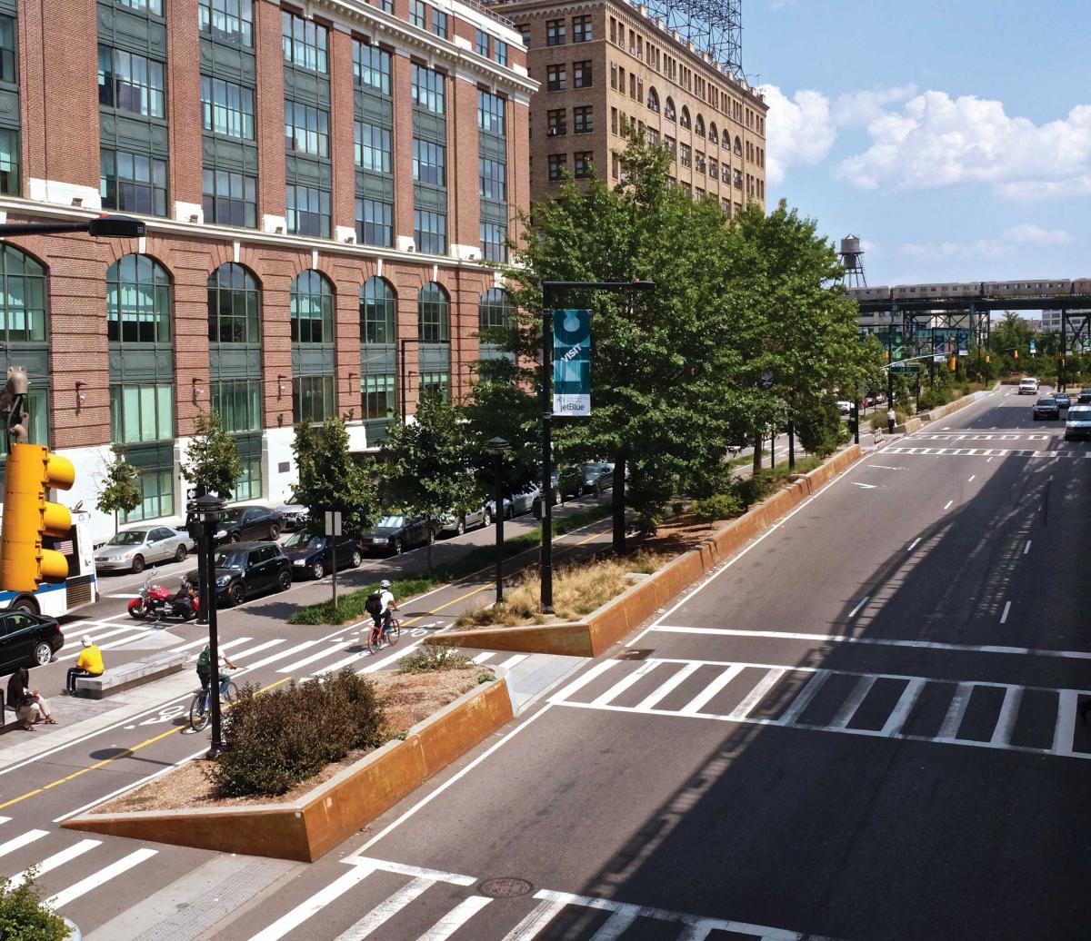
The 1-mile corridor of Queens Boulevard that runs from the Sunnyside Yards in Long Island City to the East River has been not only inhospitable but dangerous. Crossing the many lanes of traffic, some of which took unpredictable curving turns up onto the Queensboro Bridge, could be deadly, as a number of traffic deaths over the years proved. It was difficult to find your way from north to south, bridging the two low-density neighborhoods on each side. Bicyclists could hardly find their way through this morass of metal and asphalt.
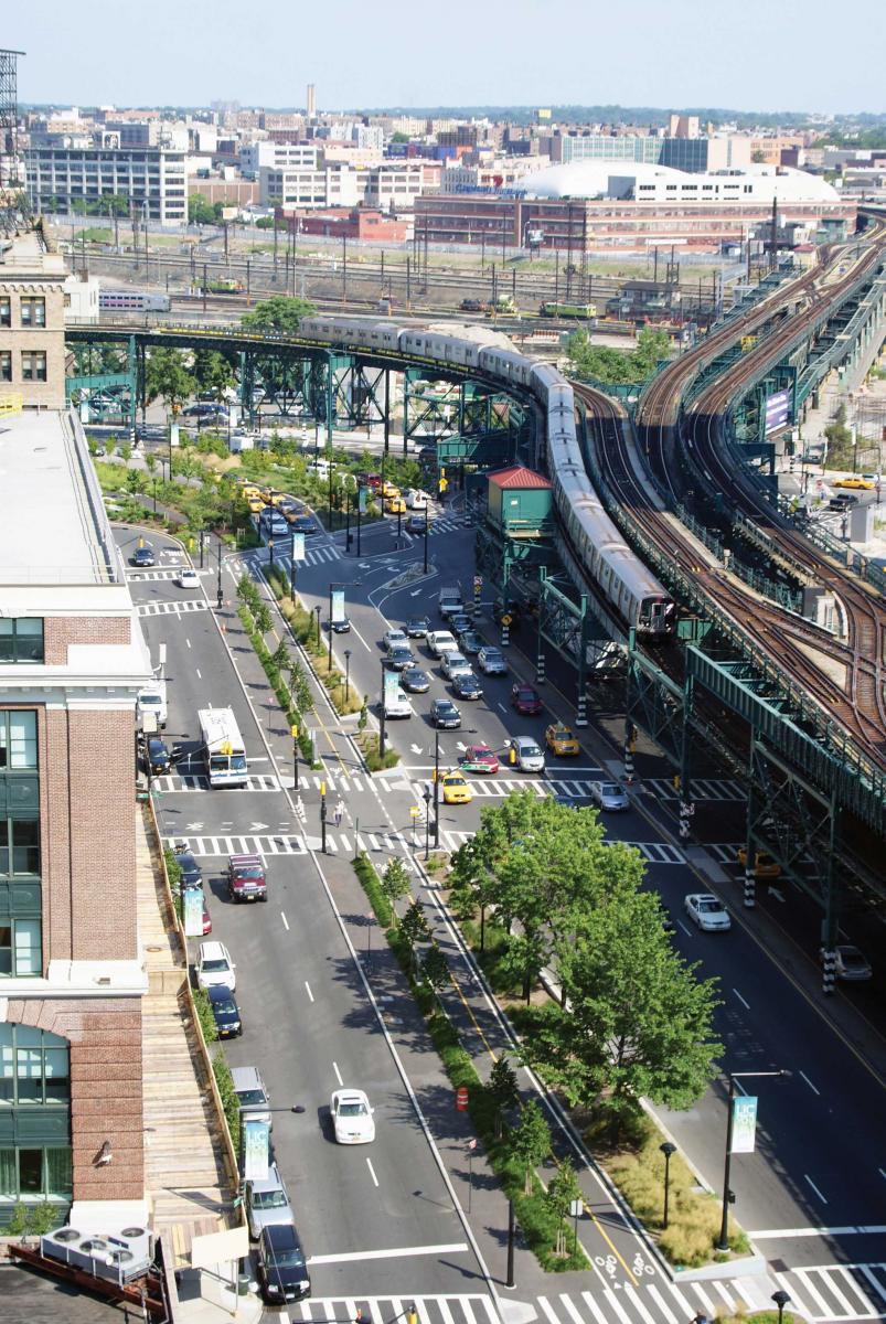
The new landscape had to reinvent Queens Plaza as a place where it’s easy to find the way to the subway or the bus, where people are happy riding their bikes from home to work, and where the industrial character of Long Island City is retained but the neighborhood made more livable. The new landscape also had to change Queens Plaza from gray to green, reinventing it as a desirable civic landscape.
The reinvention of Queens Plaza does not eliminate or screen or seek to obscure the massive infrastructure of roadway and elevated. The design takes the forces at work, such as stormwater pouring down from the bridges, and turns them into something positive. Before the transformation, the water flowing off the bridge dumped directly onto the sidewalks and streets, sometimes from more than 50 feet above. Now stormwater runs through median plantings that slow it down, cleansing it as it makes its way to the river.
Reinventing flows: People
The task for MPA, the team’s architecture and urban design firm, was to transform the structure of the elevated as part of the newly reconceived landscape. They were true collaborators on the groundplane itself, working closely with the landscape architects and also with the artist Michael Singer, whose work on the paving, curbing, and benches integrated public art into the overall design. Our approach was to reinvent the groundplane, which existed as a thin crust of pavement dwarfed by the giant infrastructure, by making it more robust, thicker, a matrix of plants and paving and benches that all felt substantial, rooted in the ground. The landscape needed to stand up to the elevated, to meet it in its force and presence. In this way we could reinvent how people move through the landscape—how the flows of pedestrians, bicyclists, cars, trains, buses, and trucks converge and disperse.
Thinking overhead
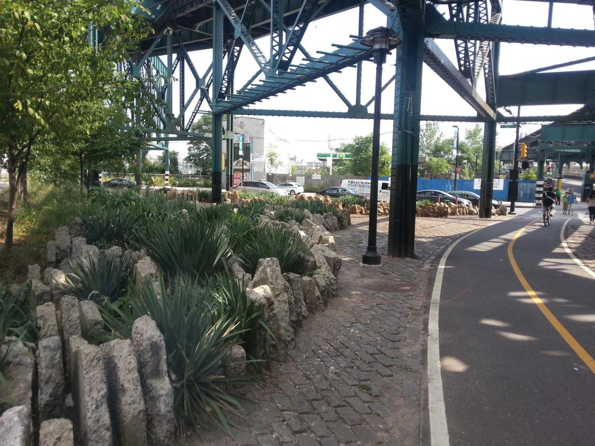
MPA’s work began with a rigorous study of the elevated and bridge structures. They discovered that there was a pattern of overhead volumes— “rooms,” Marpillero called them—made by the structural members of the elevated. If the rooms were treated as volumes, lined with metal-mesh scrims that would be lit from within, the structure would be transformed from an incoherent tangle of lines into a series of glowing lanterns. This not only improves the visual environment but provides important wayfinding, signaling to people where they can cross the street more safely from one side of the site to another. The landscape then becomes the ground over which this luminous elevated hovers.
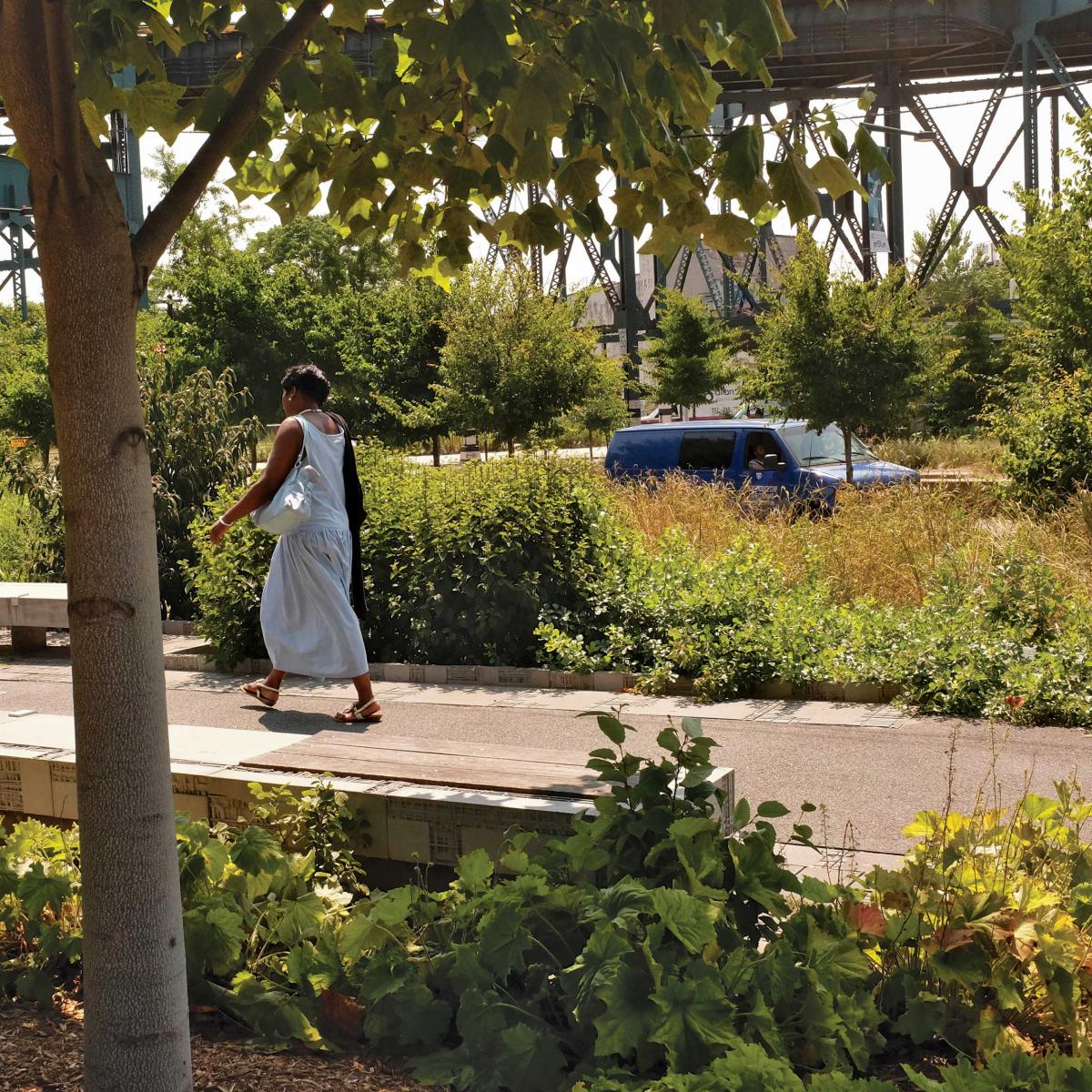
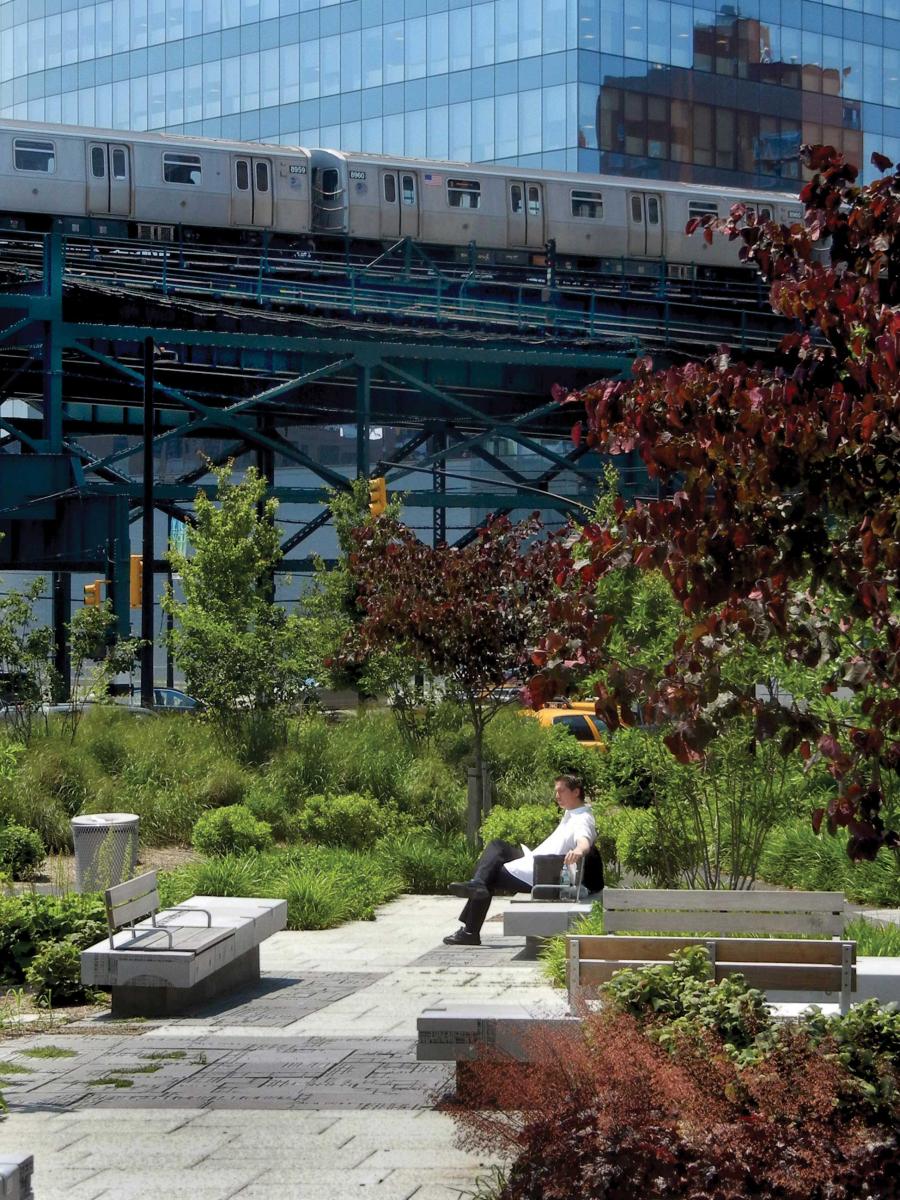
Over the course of the project, the landscape has gone from snarled to composed, from harsh to lush, from prohibitive to inviting. It has also shifted from street to park. This would not have been possible if the Department of City Planning had not advocated for a green solution. The department encouraged us to create a lush refuge at Dutch Kills Green, the 2-acre park at the top of the site. This was a radical move on their part. For decades, designers were enjoined from proposing extravagant plantings in parks for a number of reasons: Money for maintenance is scarce, and plantings of any significant height make park managers worry about crime. Managers and planners promote instead the idea of “defensible space,” that is, spaces where you can survey the whole, avoiding conditions where you might be surprised by a criminal lurking behind the bushes. But Amanda Burden, then chair of the Department of City Planning, encouraged us. We felt emboldened to create a real refuge for the city, an urban park that felt soft, immersive. The look of the landscape—somewhat wild, with irregularly planted massings of smaller understory trees and large shrubs—was not something that made many architects and designers comfortable until recent years, when the greenness of this design approach has gained currency. Design work like this frankly scared a lot of formalist architects, as well as others, who needed a very clear sense of order and abhorred anything that seemed messy, unkempt, and unwieldy. But the wild approach has gradually taken hold, and many architects are producing drawings in which the landscape is less background for their buildings, or “parsley around the pig,” as some call it, a whole environment instead of window dressing, a defining framework rather than decoration.
Thinking about scale
One of the most underappreciated design skills is the understanding of scale. Landscape type alone does not necessarily drive scale. Whether the project is residential, urban, rural, institutional, it may not matter; what matters is how big the space feels, how it relates to what is around it. Once the scale of an existing landscape has been studied, the response can either support it or remediate it. If an existing landscape or feature, such as a large blank wall, dwarfs something like a charming city street, it may be a good idea to break down the scale; this is why lattice and arbors along blank walls became popular. On the other hand, if something in the landscape is so massive that you just can’t get around it, or maybe you even find something beautiful in it, another approach is to shift the scale of the design to meet the bigness of what is already there.
The scale of the urban infrastructure at Queens Plaza required a response that could stand up to it. So even though the completed landscape on the ground looks soft and green, the landscape has an underlying organizing structure that is clear and forceful. It stretches from the infrastructure to the buildings across from it in an axial, big-boned grid. The paths are of a width that connects with the city streets. The proportion of paving to planting was studied and selected with a great amount of intention: If the paved areas were too big, the plantings would look token; if the planted areas were too big, it would not look like it was of the city.
The attention to scale ranges from the bigger decisions of layout to the smaller decisions of how to design curbs or furnishings. The relief of the artist-designed pavers, the thickness of the concrete benches, and the height and heft of the concrete and steel curbs were all designed to meet the scale of the infrastructure.
At Queens Plaza, the scale of the ground and the plantings also needed to accept the many different programmatic functions that were to coexist: biking, walking, driving, and lounging. We needed to distinguish the different ways of moving through the site, and we used lush plantings and also a distinction in the growing conditions to make the experience of traveling along one path different from traveling along another. The siting of the large subsurface wetland through the center of the park at the east end of the site, Dutch Kills Green, solved a pragmatic problem—what to do with the stormwater on the site—but it also created a unique microclimate that looks and feels different from everything around it. Dutch Kills is a layered landscape that operates in several different ways, both on the surface and underground.
Thinking Underground
A common misconception of an urban street is that it is the base on which the city sits. Buildings, bridges, and human activity occur on top of the solid plane of the ground. The only time one penetrates below the surface is to reach another built realm: the subway or subterranean shops. The design for Queens Plaza reconceived the groundplane as a porous surface, one layer of a multilayered system. It engaged the topography to reinvent the site not as one big flat space with a lot of metal above it but as a series of spaces, created by manipulating the contours of the earth.
The use of topography to build up a site—the ubiquitous berm, for example— is widely used across the board, from home landscapes to major parks. But the use of topography to go down is less commonly deployed. This is so for many reasons, probably the most critical being that even in a desert, if you dig a hole or trench in the earth you have to figure out where the water will go in a rain event (and they do occur in the desert). Unless there is an existing system to allow the depression to overflow during extreme rains, when the water fills the depression up faster than it can percolate into the ground, you will generate a lot of mess, the undesirable kind, on the site. On a big urban site such as Queens Plaza there was already a subsurface stormwater system that sends water via the curbside gutters into the city’s wastewater system, and eventually into the rivers, for the most part preventing the streets from flooding. The question of water is central to every project we do: Where does it come from, where will it stay on the site, and where is it going? Answering these questions requires that one think sectionally, not just in plan. Reinventing a large infrastructure such as Queens Plaza means reinventing how it works, making it work better, and that means looking at every aspect of it, from overhead to underground. By tying a new subsurface wetland into an existing system, we could slow water down, allowing better groundwater recharge, and create a wet meadow along the way. The metal boardwalk and overlooks were a response to this pragmatic solution to a drainage problem. We don’t just make the design and then solve the problems; often the problems generate the design, or at least add value in their solutions.
To summarize such a nonlinear design process: This landscape of pavements looks as flat as a pancake, and the infrastructure is daunting; we would like to create a more modulated topography that will increase the sense of space and create more distinction in the places to go. We want to build up: The berms planted with hornbeams can buffer the park from the roadbeds, and the raised garden of the smaller trees and shrubs can offer a more refugelike place to go. But we also want to dig down, to slow the water down and cleanse it before it goes back into the city’s stormwater system. The solution for this could be an amenity; one feature can multitask, solving a problem and making something people will enjoy. By making the subsurface wetland another place to go—with a metal boardwalk and places to sit along the way—we created three quite distinct experiences in a small park of less than 2 acres. If we had not looked at what was underground as part of the landscape we might have missed this opportunity to create a refuge for many people.
Multitasking
The sculptural details produced by Michael Singer’s studio in collaboration with the team operate on several levels at once: The curb, which keeps people from slipping over into the wetland, is also a design with texture and relief; the small gaps where the curb pieces join direct the water from the path into the wetland. It is a safety feature, it is an art object, it is a water conveyance.
These pavers were designed to be permeable in areas of less traffic; mosses and herbs grow spontaneously in these cracks. The graphic scoring and relief Singer developed relate to the industrial history of the site and provide a grooved medium in which plants take root over time.
Queens Plaza was one of the first pilot projects to test New York City’s new High Performance Infrastructure Guidelines, the green guidelines intended to make the city’s landscapes and buildings more sustainable. We recycled old pavement, designed new pavers that allow the water to flow into plantings, used native and salt-tolerant plantings, and designed the landscape to slow the water down. But like many pilot projects, the intention of the project preceded changes in the government agencies with jurisdiction over the site, so that many of the green measures either fell by the wayside or became watered down.
In the medians where we did not want people to walk, to direct them away from crossings that are dangerous or confusing, we reused the concrete removed from the old roadbeds and sidewalks, placing them on end and interplanting with yuccas. The result is a kind of hybrid infrastructure garden. Planting alone would not have stood up to the scale of the elevated. The scale of the concrete pieces looked large at first; some critics likened their appearance to tombstones. But as the plants have grown, the scale of the concrete pieces has diminished, and the appearance of the whole has softened.
The final result is a radical departure from a traditional streetscape, in the way it feels as much as in the way it works. It feels like Long Island City: gritty, human-scaled, linked with an august industrial past that included some of the city’s premier craftsmen’s workshops. But it also feels like a park, a place where people can gather, feel comfortable, find respite. Queens Plaza reinvented is still a tough and industrial landscape, but it is also lush and green.
The original acoustic analyses suggested that we would not be able to reduce the noise levels from the elevated significantly. Although earth would be the most efficient sound buffer, we could not raise the grade high enough to dampen the sound of the screech. Precedent studies indicated that planting would reduce the noise levels only if they could be wide; a 100-foot-wide swath of trees was considered to be a sufficient buffer, and we only had slivers of space for tree plantings. But a postoccupancy study conducted by the Landscape Foundation found that the average ambient noise within the open space was reduced by 23 percent. By removing two lanes of traffic that formerly bisected the space and adding lush vegetation, we decreased noise from traffic and the elevated rail lines from a typical range of 85–101 dB to 69–75 dB. That is equivalent to changing the site from the decibel level of Times Square to the level of a Soho street. The man sitting in the photograph below looks as if he is not terribly disturbed by the traffic coursing through the site (a taxi is visible approximately 20 feet behind him) or the train screeching above.
This article was an excerpt from Wild by Design, Strategies for Creating Life-Enhancing Landscapes, by Margie Ruddick, Copyright © 2016 Margie Ruddick. Reproduced by permission of Island Press, Washington, DC.